Part One: Mark-Making and Tone
Notes for first series of exercises were made in sketch book but later evaluations of exercises will be recorded via the blog, as per the final image on this post.
Project: Making Marks
Exercise: Holding Pens and Pencils

~

~

~

~

Exercise ~ Doodling

…

…

Exercise ~ Mark-Making Techniques

~ Initially, the stippling and cross-hatching exercises seemed reminiscent of the work of Roy Lichtenstein, such as the piece ‘Seductive Girl’ below:

Roy Lichtenstein: 'Seductive Girl'
Lichtenstein’s marks serve to similtaneously digitise and de-humanise the female subject, reducing her to the level of the mechanical. The print-like quality of the marks and the cool, emotionless, mechanical properties of the dots and lines contrast markedly with the soft curves of the female form, both emphasising their organic quality and accentuating their voluptuous allure. Lichtenstein’s marks illustrate the impact that choice of mark and mark-making tool can have on overall visual impact and composition.

Exercise ~ Using Charcoal

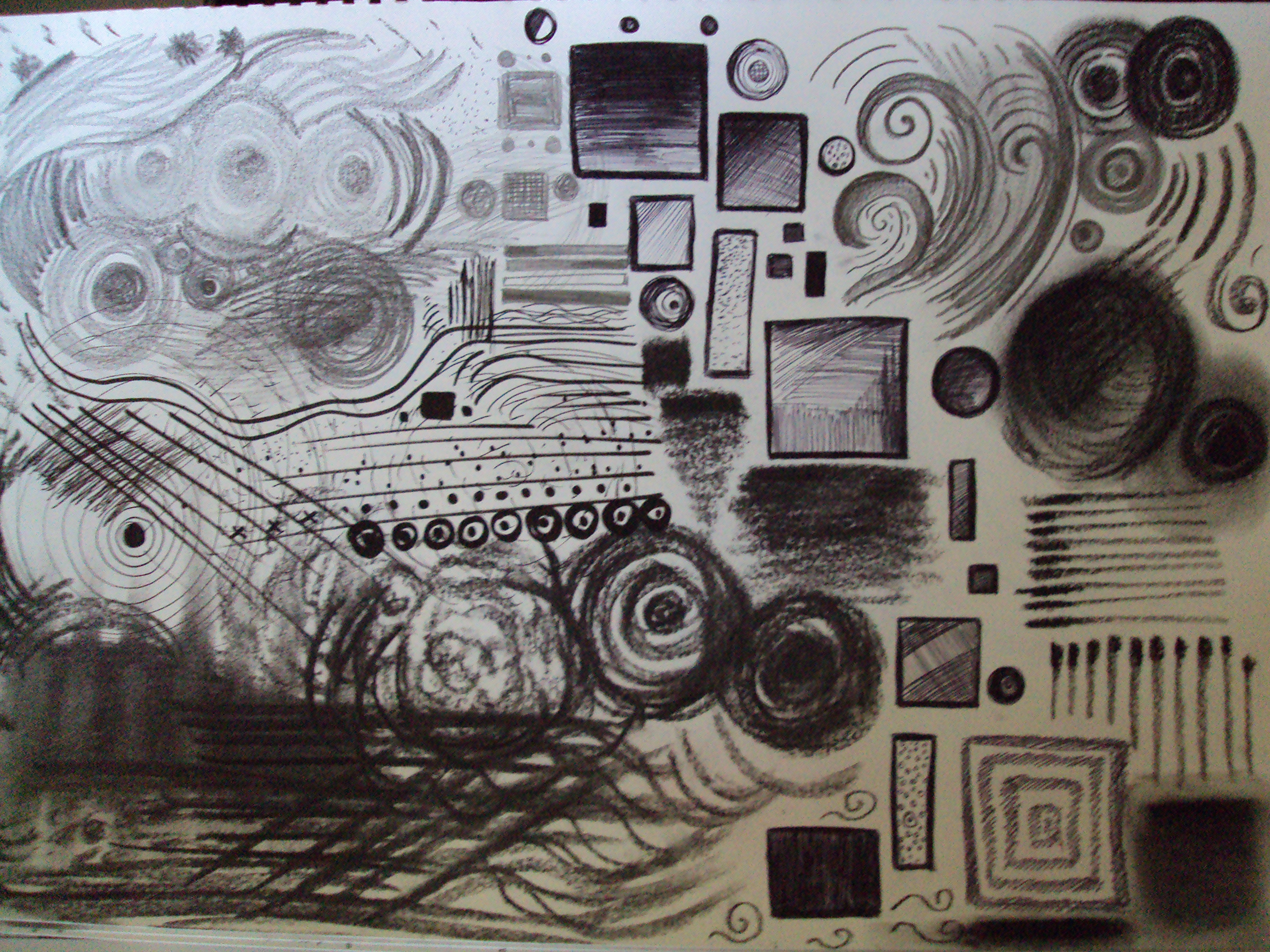
Exercise ~ Line and Other Marks

1. Pencil ~ A variety of bold, jagged, zig-zag marks. Convey a sense of ordered frenzy through the pace of mark-making and the constraints provided by pencil as a a medium. 2B pencil used for softer lines to contrast with the harsh nature of the shapes and action of mark-making.
2. Pencil ~ 6B. Patterns and divides. Both assertive in the flowing curves and tentative in the lines that cross them. Strong rhythm, leading the eye around the square. This is predominantly created by the continuous curves, which were rendered without removing the pencil from the page.
3. Biro ~ Bold, strong lines to arrest the eye. These combine with decisive, almost scribbled horizontal marks suggestive of a curved, three dimensional surface. Strong sense of a particular shape or form here, despite there being no recognisable object as such.
4. Charcoal pencil ~ Tentative marks comprise this image of a goldfish bowl, which arose out of the marks themselves rather than as a pre-conceived idea. Broken dashes and dots give only a vague indication of form and convey the movement of the fish in its limited environment quite effectively, forcing the eye to skim over empty areas of the square.
5. Willow charcoal ~ Sweeps of charcoal, an ideal medium for smooth movement, created this ‘essence’ of a cat, from tail to whiskers.
6. Willow charcoal ~ Illustrating the diversity of the medium for drawing and sketching, bold, thick, heavy lines provide intensity within the image and the repetition of the strokes conveys speed as well as force.
7. Coloured biro ~ Pattern and repetition were the focus here, with two pens held simultaneously in one hand and the same ‘sqaure/circle’ movement repeated three times with six different coloured pens in layers. The effect is reminiscent of a spirograph, an ironic contraption fusing creativity with mathmatical, geometric limitation.
8. Fineliner ~ Holding the pen at the very top, with little control over length or pressure. The result was surprisingly smooth and decisive in terms of line.
9. Pen ~ Little variation possible in line intensity, producing quite a flat, consistent image. Good for illustrative work, as all pens are?
10. Charcoal pastel ~ Bold and messy, but provides real textural intrigue. A very strong and evocative medium best suited to large, expressive marks.
11. Brush ~ A very chaotic square that threatened to take over the page! Dipping the brush in ink and then dropping it onto the page was enjoyable in terms of the level of action/action painting involved and also rather exciting, as although some marks were repeated the overall effect was dreamlike and intriguing, as one attempts to make sense of the marks and ‘see’ what pictures/emotions/images they evoke.
12 ~ Willow charcoal ~ Circles and pawprints. Differing hand holds (tight/loose, tip/edge)
13. Dip pen and ink ~ Very calm, measured and precise marks. Soothing process owing to extensive control over the medium. Thin and thick marks possible and ideal for rendering detail. Reminded me of drawing staves and treble clefs: the medium can be smooth and flowing in terms of stroke but also precise and mathmatical, hence the musical theme.
14. Non-brush end of a paint brush and ink ~ Produced an intriguing series of dots and lines. Square reminds me of a computer microchip. Rewarding experiement: taught me the value of marks made outside of ‘conventional’ mark-making tools, a lesson accentuated by:
15. Scissors and ink ~ By far my favourite experiment, these jagged, spidery marks seem somewhat eldritch and would be ideal for conveying frenzy, distress, darkness and horror. Scissor blades give a sharpness to the lines and marks that no other tool could.
16. Oil pastel (worked into with scissors) ~ Scratching marks into the pastel illustrated the value of negative space in an image, forcing me to think ‘in reverse’ in terms of starting with a coloured ground and then removing colour as opposed to adding it.
17. Conte crayons ~ Staccato, stop/start marks. Great for rendering movement.
18. Chalk pastel ~ Geometric shapes and holding the pastel at the very top alleviate lack of control of the medium and also help to minimise smudging.
Squares 6,10, 13 and 15 evoke the work of Aubrey Beardsley, an artist whose pieces, rendered in monochrome, draw specific attention to marks and lines in their composition:

- Aubrey Beardsley, ‘Merlin’

Monochromatic work allows for maximum focus on the quality and strength of the marks and forms present in the composition. Beardsley’s intricate work fuses a dark ground with strong lines, flowing marks and extensive areas of negative space to lead the eye around the picture, leading the eye round the circle to focus on the figure’s downward gaze. The movement created by this use of marks is almost reminiscent of drawing a spell circle, or waving a wand.
