Assignment One: Part One (Man-Made Objects)

To commence this assignment, I utilised the skills developed in previous experiments with line, form and composition to create what I hoped would be an arrangement of man-made objects that was both visually stimulating and reflected personal interests and emotional aspects of myself:

Running shoe, swimming goggles, shoe laces, iPod Shuffle, knee support, pencil case (background) assembled on wood table

This quick initial pencil sketch enabled me to assess aspects of the composition that were strong, but also identify those that were weak.  For example, I was worried that the swimming goggles, although reflective of the intricate lines of the shoe laces, overcomplicated the arrangement and detracted from the contrast between the shoe itself and the area of almost negative space provided by the knee support, which had little texture aside from weaving in the fabric.  Nevertheless, I was unsure whether to remove the goggles, as I felt that the curved lines and general form complimented the swirling laces in the same manner as running compliments swimming: the two marry together to prevent injuries (and their accompanying heartache), as represented by the knee support.

However, for the purposes of development, I decided to remove the goggles to see whether it would strengthen the individual identity of the shoe, which, like my love of running, was intended to be the main focus of my study.  Although compositionally interesting, including the background detracted from the way the objects related to one another at this early stage: re-introducing it at a later point would allow me to compare proportions, heights, depths and forms.  Hopefully, this would result in more informed development of the composition, and also the tonal relationships within the composition.

Compositional development and media experimentation (black and white): brush pen (line only), charcoal pastel, fineliner (hatching), charcoal, biro (cross-hatching)

Completed within the first study session (of three), this page details my experimentation with media in black and white, composition and viewpoint.  I felt that my earlier successes with elevated viewpoints created a better sense of solidity within the objects: my initial sketch lacked this solidity and depth, resulting in the objects seeming rather flat.  In the first line drawing, I was able to identify formal relationships within the objects and the way that the shoe laces often seemed to absorb the objects in front of them due to their intricate forms, almost entangling the ipod and separate laces in their curved, weaving web.  The resultant loss of identity of the objects in front of the shoe led me to reconsider the composition: although shapes within the still-life were more relevant than the objects in themselves, I still wanted the final composition to feature aspects of every intriguing form.  Losing too much of those forms would create a sense of confusion and chaos that was not my intention for the piece.  Man-made forms, in many respects, seem rather structured and graphic/illustrative in quality, and this is something I wanted to reflect in my final piece.

Further development of the object arrangement and viewpoint (front-on) in charcoal pastel emphasised a problem in the compositional process: strong shapes and forms, particularly in the arrangement of the laces, abound in both a side and front-on view of the shoe.  This led me to wonder whether the addition of a second shoe could alleviate this issue, or whether it would make the arrangement too busy and muddled.  Charcoal pastel was also not the ideal medium for such a detailed piece, as many details became blurred and much of the texture/patterning of the shoelaces lost.  However, it was helpful for sketching the perspective of the shoe quickly and identifying the strong structures within the shapes through overlaying/drawing as if the objects were transparent as in an earlier exercise with square/rounded objects, due to the bold, unwavering quality of the lines created by the medium.

Altering the composition again to draw the shoe from behind in fineliner added an intriguing dimension to the formal relationship between the looping laces and ellipses forming the texture of the front of the trainer, accentuating the connection between the two due to the foreshortening of perspective created by the viewpoint.  I found this viewpoint highly challenging to draw and the result is not accurate, the angle of the trainer skewed by my inability to render the angle of the shoe in addition to the difference in depth/graduation from heel to toe.  The graphic quality of fineliner leant itself to the shapes and structure of the objects well, but having explored this medium for most other earlier pieces I wanted to challenge myself more for the final composition.  Hatching and cross-hatching proved ineffective and detracted from the detail of the shoe, and also made it difficult to define the texture of the laces and other elements clearly.  Consequently, I suspected that the softer approach to shading provided by pencil and/or charcoal might be more appropriate for the final composition.

Charcoal and biro in the final two drawings emphasised the contrast between soft and harsh lines present in both the potential choice of media and the compositional arrangement: smudging the charcoal blurred the lines excessively and resulted in a loss of detail and accuracy, yet the harsh lines created by biro and hatching did not capture the soft curves of the laces, iPod edge and knee support with particular flair.  I was still not satisfied with the composition or viewpoint at this stage, so for the next series of drawings I chose to reduce the components and viewpoint to a more simplistic arrangement to allow me to discern potential compositional strengths and weaknesses further.

Colour sketches showing possible variations and materials used: consistent composition: chalk pastel, oil pastel, conté crayon, colour pencil, biro, permanent marker (stylised).

To concentrate on possible variations in materials, and the process of introducing colour, I kept the working composition consistent.  I removed the knee support altogether as I felt that the sense of negative space created by its lack of texture and blank form stood out too much in the composition and did not allow the eye to roam around the arrangement or appreciate the flowing lines of the shoe laces and other elements.

Instead, I included a sticker sheet with round-edge squares and hearts, shapes that complimented the combination of straight lines and curves present in the form of the iPod.

I attempted to stylise each image slightly depending on the medium, but on reflection decided that for my first project an attempt at accuracy would be best: before attempting anything abstract or overly expressionist it is first necessary to develop an understanding of tone, line, shape and form.  Distorting these elements without studying them first would lead to misinformed decisions and possibly weak pieces.

Nevertheless, the bold graphic result provided by a minimal palette using biro and permanent marker in drawings five and six again illustrated the graphic potential of the arrangement of objects, while softer media in the first three drawings (chalk pastel, oil pastel and conté crayon) allowed me to explore shading and blending tones within the arrangement of objects.  Colour pencil in drawing four produced perhaps the strongest result, with a good balance between definition and tonal variation.  This led me to suspect that either pencil or colour pencil would be most appropriate for the final piece.

Small-scale finished sketch for A2 final piece: conté crayon, A3

This colour sketch finalised my decision to render my final piece in black and white.  Although the tonal relationships were enlightening to explore, I felt that form and line were the most crucial elements of this composition, and using colour rather lost those relationships.  When I first set out to create the final piece, exploring form and line was my primary intention and the particular arrangement of the group of objects, along with the illustrative quality of the clean lines and pattern of the running shoes being the primary feature of the still-life arrangement.  This sketch allowed me to explore tonal relationships, meaning that I understood those relationships in depth before detailing them in the final piece, but the soft medium of conté crayon, along with the variation in colour and tone, detracted from the focus on the shapes and relationships between the objects, particularly in terms of positive and negative space.  However, the tonal gradient on the background wall was something that I found positive about this sketch, as it captured the sense of light and shadow accurately (this is something I often struggle with), so I endeavoured to retain this accuracy in my final piece.  Adding the swimming goggles and an extra running shoe to the composition, along with elevating the viewpoint further, added depth to the arrangement.  Deliberately leaving some of the objects half-fitting onto the page also created a sense of space outside of the composition, a sense that there was a world around the image and an accompanying visual intrigue, as opposed to the objects being isolated in a singular world that did not extend beyond the edges of the paper.  This helped them to seem more ‘real’, more tangible to me.   In addition, draping the goggles over the shoe and brightening the light source coming from the top right allowed the shadow of the goggles to differentiate them from the shoes, avoiding the tonal blurring that earlier led me to remove them from the composition.

Final Piece: H and 9B Pencil - altered light source

In this final piece, I attempted to combine all of the positive elements of my previous studies both for this assignment and in my previous exercises.  A slightly elevated viewpoint, along with a stronger light source from the right lended three-dimensionality to the objects.  The proportions and sizing of the components are reasonably accurate, though once again there is room for improvement in this regard, particularly in relation to the perspective of the left-hand shoe.  Adding another shoe to the composition highlighted the interesting shapes that I felt were overlooked from a side-on or front-on only view of a single shoe, something the preparatory work allowed me to see.  I feel that I sufficiently explored the range of options available in terms of media and composition in my preparatory sketches, but I could have experimented more with mixing media to render texture, something that I feel was rather neglected until the final two drawings.  I don’t believe this piece is as strong or innovative as my mixed media paint jar/feather assemblage from an earlier exercise due to the mundane manner in which I simply combined soft and hard pencil to render texture.  For the natural objects still life, I will certainly explore mixed media possibilities further.  Nevertheless, the simplicity of pencil has allowed me to concentrate on the form and line of the objects, in what would otherwise have been an excessively complicated arrangement had colour been added to the final image.  In this respect, it may indicate that the composition was, in the end, overcomplicated and some elements should have been omitted.

I would not alter the arrangement of the objects if I were to repeat the exercise, as my compositional experimentation formed the most extensive part of my preparatory work and I believe my decisions were informed in this respect.  Working on a larger sheet of paper (the drawing is A2) would not have strengthened the drawing because I deliberately chose to structure the image so that parts of the objects did not fit onto the page, lending a sense of continuation beyond the boundaries of the paper’s edge/frame ~ hopefully, this was a successful decision from an external viewer’s perspective.

The earlier exercises prepared me well for drawing such complex objects, arrangements and shapes.  Techniques such as hatching and cross-hatching were not overly problematic, again due to earlier practice.  Overall, there is room for improvement in the image, but I feel I have learnt from my first assignment and can carry this knowledge over to develop the second element, a still-life composition of natural objects.

Posted in assignment, chalk pastel, charcoal, crayon, ink, media, oil pastel, pen, pencil, Uncategorized | Tagged , , , , , , | Leave a comment

Learning Log Entry ~ 26/11/10

Exercise ~ Enlarging an Existing Drawing

Ink Bottle, HB Pencil, 10x10 and 20x20cm drawings

This study was extremely helpful for me, as it forced me to meticulously pay attention to the proportions and forms of the objects.  Using a grid enhanced my accuracy in drawing, and the organised, structured quality of the grid appealed to my need for security and guidelines for my work.  I was rather successful in my first attempt to copy the smaller image into the squares with this simple object.  However, I feel that by including shading I detracted from the transference of the lines and did not best showcase my efforts as a result.  Therefore, in the next exercise I chose to focus on line with minimal shading.

Exercise ~ Enlarging a Simple Flat Image

HB Pencil, Initial Sketch, 10x10cm drawing, 20x20cm drawing

~


Objects: Half-Full Wine Glass, Two Roses, Dove Figurine, Pear, Apple

Without the distraction provided by transferring tone as well as line, I was able to transfer the lines from the smaller squares to the larger squares more accurately and concentrate on the balance of forms between the objects.  This exercise enhanced my awareness of both form and space, particularly negative space.  I am reasonably satisfied with my larger replica image, although in a few places the lines overlap the squares inaccurately.  Nevertheless, the progression of my ability to depict proportion and perspective is clear from the initial sketch, where the wine glass is far too large in relation to the other objects, through to the largest image where the objects are, in form at least, almost true to life.  The rigidity and comfort provided by the squares removed much of the anxiety I experience when drawing, which has encouraged me to question my pre-supposed affinity with Expressionism.  If I were to repeat the exercise, I would attempt a more complicated composition and reintroduce tone and shadow, to challenge myself further and attempt to overcome the difficulties experienced in the first exercise relating to tone.

Posted in pencil | Tagged , , , | Leave a comment

Learning Log ~ 24/11/10

Exercise ~ A Drawing With Textures

Mixed Media ~ Ink, Charcoal, Charcoal Pencil, Graphite Stick, Charcoal Pastel, Biro

~


Techniques: Smudging, Smoothing Out With Eraser, Highlights With Putty Rubber, Dropping from a Dip Pen, Hatching, Curved Lines, Scratching with Blunt Tip of Paint Brush (Non-Bristle End), Straight Lines, Dripping and Spreading Ink with Pipette, Scratching with Dip Pen, Swirling Ink

All of the work and experimentation in previous exercises prepared me well for this piece, both in terms of composition and selecting appropriate techniques.  The assemblage comprised of two feathers and two paint brushes in a glass jar, sitting atop Hessian fabric.  On the fabric were two apples behind the jar and a leafy twig on the bottom left.  I placed the assemblage on wooden floorboards, and recalled the strengths of an elevated viewpoint from earlier trials with composition.  This viewpoint allowed me to focus on textures and perspective simultaneously, and also work on my ability to depict the proportions of objects accurately.  I have seen my skills improve in this respect, and the viewpoint helped to create, suggest and imply form without an excessive need for tonal hatching.

Using a wide range of techniques and media has allowed me to see how many different and diverse ways there are to utilise a drawing tool to give an impression of surface texture.  My preferred method of ink scratching with the non-bristled end of a paint brush seemed highly appropriate for both the textures of the feathers and of the wood.  Softer, more blendable media such as charcoal provided textural contrast for other areas, reflective of the quality of the medium itself, with ‘mid-textures’ rendered in partially blendable media such as charcoal pencil and graphite stick.  As a result, it was possible to depict the full range of tones and textures with reasonable accuracy, but also to suggest texture in certain areas, to imply the feel as well as the look of the objects and make them seem tactile/tangible, particularly in the case of the Hessian cloth using a technique with charcoal pencil earlier discovered in relation to a synthetic wool glove.

Posted in charcoal, dip pen, graphite stick, ink, mixed media, pen, Uncategorized | Tagged , , , , , , , | Leave a comment

Learning Log Entry ~ 23/11/10

Project ~ Using Texture

Exercise ~ Experimenting With Texture

1.) Body Brush ~ Biro

The thin, scratchy lines created by biro are well suited towards brush or hair-like textures, particularly for man-made materials.  Repetitive, swift movements using predominantly straight lines emulate the harsh texture of the bristles effectively.

2.) Facial Exfoliator ~ Fineliner

The exfoliator’s weaved texture meant that although similar movements were required to the body brush, a softer medium was required ~ fineliner tips give a smoother effect than biro, but something with more tonal variation such as pencil might have been more appropriate for this complex texture.

3.) Lace Trim on Jacket ~ Felt-Tip Pen

The combination of curved and squiggled lines successfully emulates the texture of the lace, and gripping the pen quite freely helped to produce this effect, a method of using the drawing tool that I had not considered before.

4.) Lemon Peel ~ Dripping and Spreading Ink with Pipette

Dropping ink to describe how the texture of the lemon looked and felt was an enjoyable experience, partially because it lessened my control over the ultimate effect and even though the result is not a totally accurate depiction of texture, it seems like an accurate representation of said texture in terms of the tangibility as well as aesthetic appearance of the object.  This has taught me that describing texture is not just about photographic replication, but about conveying the physical touch of an object, the way it feels against one’s skin and the effect it has on the senses.

5.) Orange Peel ~ Coloured Biro

Almost doodling freely into the square using the experience of being able to draw more loosely afforded by the previous two textural experiments, by altering the direction of the marks and the grip on the pen I was able to create quite an original effect remininscent of the orange peel, but I would still have preferred more of a sense of depth, representative of the dimples in the skin.  Perhaps using a pencil shadow as a ground before overlaying with pen might produce such an effect?

6.) Cheese Grater ~ 3B Pencil

Soft marks and smudging provided an interesting effect, particularly when the object in question mostly comprised of clean lines and sharp edges.  This illustrates the benefits of experimentation whereby the least obvious solutions and techniques can become beneficial in terms of altering one’s perception of an appropriate medium.

7.) Acrylic Glove ~ Charcoal Pencil

The combination of straight lines and swirls captured the texture of the glove reasonably well, and the sketchy quality of a medium charcoal pencil provided a good balance between the softness of the fabric and the definition of the individual strands within it.

8.) Fluffy Jumper ~ Conté Crayon, Smudging and Scribbling

Again, this provides more of an impression of texture than an accurate rendition, and greater control over the extent to which the conté crayons smudged would have produced a slightly more defined and accurate effect.  Using two crayons in one hand to render dual colours within a fabric is a technique modified and adapted from earlier exercises, and I still believe it to be a good method of rendering duality of tone.

9.) Webbing on Running Shoe ~ Coloured Biro with Water Used to Blur Shadow

Unfortunately, although the strokes and method of making marks quickly with two colours of biro emulated the webbing of the shoe quite well, when I came to smudge using water to render shadow within the texture the result became too blurred and resulted in somewhat of a messy effect ~ in the future, I would use less water and a pipette as opposed to fingers to apply it.

10.)  Zip on Synthetic Leather Purse ~ Ink with Non-Brush end of Paint Brush Used to Spread Medium ~

A surprisingly evocative effect ~ spiky, grainy, and seems to capture the form and function as well as the texture of the zip.  The blunt end of a paint brush has proven to be a highly useful tool for mark making over the course of my experiments with form and texture.

11.) Car Sponge ~ Pen, Highlighter Squiggles and Coloured Pencil Marks ~

Mixing media produced a slightly confused result in terms of texture: my mistake was to vary the marks as well as the media and attempt too many layers, meaning that the result is too scratchy and a lot of the soft, intricate texture of the sponge is lost.

12.) Bubble Wrap Swirls ~ Silver Permanent Marker ~

The reflective quality of the plastic bubble wrap comes across visually quite well here, owing to the naturally shimmery line provided by the silver permanent marker, something accentuated by the soft swirls of the marks I made.  Again, this is lacking in depth from the point of view of giving the impression that the bubbles themselves are raised from the background: this is where tonal hatching would be helpful in terms of rendering form.

Frottage (9B Pencil):

13.) Body Brush

Sadly, the brush bristles were a little too soft to create much of an impression while using frottage ~ placing the paper over it to create an impression of the object was less than successful in this respect: frottage seems most effective when the object itself has a hard, harsh, clearly defined texture.

14.) Wooden Barometer ~

The pattern of the barometer came through quite strongly, but as it was part of the whole component it didn’t necessarily convey much of the object itself or its function.  Texturally though, the result was intriguing and the marks themselves more clearly visible than my first attempt.

15.) Sole of Running Shoe ~

This was the first instance in which I could conceivably see using frottage as a viable method of drawing ~ the sole of the shoe, particularly something as emotionally loaded for me as a running shoe, records all the journeys the shoe has taken, all of the memories imbued within it.  Because the marks are recorded as accurately as possible by taking a direct rubbing of the texture, the ‘soul’ of the sole can be captured.

16.) Hot Water Bottle ~

For a soft surface, the texture of the hot water bottle came through quite well and the marks seem more organic and less contrived than if they had been drawn.  The spontenaiety of line illustrates the benefits of frottage, which although unpredictable can mimic texture accurately given the right surface selection.

17.) Pound Coins ~

A homage to the nostalgic technique of coin rubbing, the overlaying forms and images of the coins create an effect reminiscent of an optical illusion, or a sense of three dimensions via layering.

18.) Bathroom Tile ~

Combining texture and pattern, this final frottage exercise conveys the potential of frottage as a drawing technique: difficult to manage though it sometimes is, this is often compensated for by the speed and ease of conveying surface texture via direct representation.

With frottage, the drawing can be left as is or used as the basis for further refinement. Superficially, the process reminds me of brass rubbing and other forms of rubbing intended to reproduce an existing subject.  Frottage differs in being aleatoric and random in nature and as such often produces quite dreamlike, surreal marks.  Surrendering control in this way is both liberating and intimidating: as my experiments show, the results are diverse in quality.  As a drawing technique, it would take many trials with a specific object to produce a particular effect using frottage, especially with a pre-planned composition.  It seems ideal for ‘free’ drawing and experimentation though, due to its unpredictable nature.

Information below from:

http://www.tate.org.uk/collections/glossary/definition.jsp?entryId=113

Frottage

Max Ernst, Forest and Dove, 1927

~

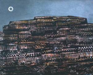
Max Ernst, The Entire City, 1934

Surrealist automatist technique developed by Max Ernst in drawings made from 1925. Frottage is the French word for rubbing. Ernst was inspired by an ancient wooden floor where the grain of the planks had been accentuated by many years of scrubbing. The patterns of the graining suggested strange images to him. He captured these by laying sheets of paper on the floor and then rubbing over them with a soft pencil. The results suggest mysterious forests peopled with bird-like creatures and Ernst published a collection of these drawings in 1926 titled Histoire Naturelle (natural history). He went on to use a wide range of textured surfaces and quickly adapted the technique to oil painting, calling it grattage (scraping). In grattage the canvas is prepared with a layer or more of paint then laid over the textured object which is then scraped over. In Ernst’s Forest and Dove the trees appear to have been created by scraping over the backbone of a fish.
Posted in charcoal, crayon, graphite stick, mixed media, pen, pencil, Uncategorized | Tagged , , , , , | Leave a comment

Learning Log Entry ~ 21/11/10

Exercise ~ Observing Negative Space and Perspective

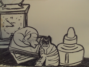
Image 1 ~ Staged Line, Charcoal

In hindsight, charcoal may not have been the best medium to choose for this exercise owing to the tendency of the medium to smudge, as illustrated with the cat figurine’s face.  However, the process of first drawing the top outlines of the objects, followed by the bottom outlines and then filling in the object details was an enlightening one in terms of promoting accuracy of proportion and observation of negative space.  Unfortunately, the end result is somewhat skewed as the course materials warned it would be, but this emphasises the degree to which my observational skills still need to grow and be enhanced by further still life work.


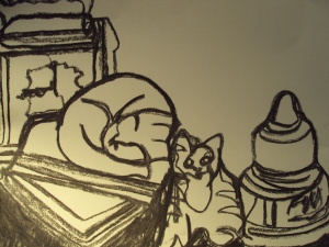
Second Attempt ~ Continuous Line, Not Removing the Tool from the Page

Strangely, keeping the charcoal stick in contact with the paper constantly produced a result very similar to the first exercise.  In places, the sense of perspective and proportion of the objects is actually more accurate than in the first instance, for example the cat lying on the books sculpture.  I was really able to define the negative space and the composition of the objects by doing this, and also observe the nature of their forms tangibly, as opposed to formulating a composition in one’s mind and then applying it to an arrangement of objects before commencing the initial sketches.  A very useful exercise.

Posted in charcoal | Tagged , , | Leave a comment

Learning Log Entry ~ 19/11/10

Exercise ~ Composition of Natural Objects

Sketches from different viewpoints and in different media: trying out compositions and effects and experimenting with viewpoint.

Top to bottom, L-R

1.) Biro, hatching and lines.

2.) Line, felt-tip pen.

3.) Cross-hatching, fineliner.

4.) Stippling, charcoal pencil/graphite stick.

'Flat' arrangement, slightly raised viewpoint (banana, two apples, one pear)

In this composition I attempted to create a sense of solidity by staggering the objects, despite the banana laying flat on its side, and creating a slightly raised viewpoint so the components were not viewed head-on.  Nevertheless, this image still seems a little flat and lifeless.  The fine lines created by the biro also lessened the sense of solidity in the various forms, and a stronger type of mark/medium was needed, in addition to an altered arrangement of the objects.


View directly from above, banana shifted to the right, apples swap position

Shifting to a view almost directly from above resulted in a better sense of perspective and solidity in the objects, but still did not make for the most interesting composition in terms of the shapes and lines of each component.  The banana and the pear in particular have intriguing curved forms and I do not feel that this composition makes the most of these aspects.  The arrangement of the composition, and changing the composition, definitely affected the way I approached the piece and created a sense of form: certain arrangements require one to vary the order in which marks are made, the strength of line and the manner of making marks (sweeping strokes, for example) to accommodate the layering of the objects and to accentuate the strengths of forms that seem interesting.

I enjoyed using fineliner to create bold, illustrative lines as a felt they lent a graphic quality to the natural objects that accentuated their curved forms, which seemed rather too soft and lost when rendered in media such as pencil or biro.  Simple line drawing does not fully convey depth or texture as well as I would like, so an element of shading and shadow would also be needed, along with a different composition.

View skewed and from above, all components moved, banana balancing on top of other fruit.

The perspective of the banana balancing on other fruit was highly challenging to draw and provided visual interest, but I felt that hatching did not suit the objects as a method of shading due to the intricate textures and patterns already present on the fruit, which hatching detracted from.  Fineliner also did not provide strong enough marks to render the solidity and perspective of the objects to their maximum potential.

Elevated view, pear moves to the back, apples to the side, banana balancing in the centre.

Stippling had a similar effect to cross hatching, although this viewpoint was slightly more successful in terms of conveying perspective.  Charcoal pencil and graphite sticks did provide a diverse range of tones for light and shadow, but I feel it would be more of a challenge for me to branch out into using pen.  After my early tentative experiments, I am eager to produce a successful piece in pen without encountering the mark-making problems in terms of strong lines rendered with conviction and accuracy of form that I encountered before.

Felt-tip pen, new composition based on view 1.

Final image: in this piece I combined the composition of my first sketch with the viewpoint of my fourth, as I felt that this would maximise the sense of solidity in the objects while showcasing the rounded forms of the fruit to their maximum potential.  I attempted to stylise the pattern of the fruit slightly and combined line drawing with strong areas of shadow to make the objects bold and striking, hopefully building on the strength of my composition.  I used no under-drawing for this image, something which indicates a lot of progress for me as the proportions of the objects are correct and the lines smooth and unbroken.  Overall, I am quite pleased with the result, particularly in terms of the texture created by my combination of mark-making techniques and my confidence in making marks.

Stylised strokes combining line-drawing and shadow

I believe that it is very slightly easier to suggest three dimensions on man-made objects, as opposed to natural ones.  This is because the former tend to have more angular forms and reflective surfaces, which make it easier to suggest three dimensions via reflected as well as cast shadow.  Square as opposed to curved forms are also easier to depict in terms of creating a sense of perspective because they have very clear edges and end/beginning points in their surfaces.  However, a strong composition and viewpoint can create a sense of three dimensions regardless of the origin of the objects, which makes deciding how to position oneself vital as well as arranging the objects themselves.

Posted in graphite stick, mixed media, pen, pencil | Tagged , , , , | 1 Comment

Learning Log Entry ~ 18/11/10

Exercise ~ Drawing and Sketching Made Objects

Arrangement to describe myself: two Garmin watches, a running shoe, two metal sculptures (a skull and a dragon)

I selected objects to describe myself and my love of running, which has been taken from me for the past month and foreseeable future my a knee injury no-one seems able to diagnose.  This was consequently an emotionally charged piece for me to arrange, compose and sketch.  The watches and running shoe are counterbalanced by the dragon and skull, illustrating my fury and frustration at my situation.  The arrangement of the objects is based primarily on their contrasting forms, the smooth curves of the shoe offset by the more angular watches and the complex, intricate details on the sculptures.


Light source: first image from the top right, second image from above, third image from the top left.


This has been the most  successful exercise so far for me in terms of accurately rendering the proportions and perspective of the objects, despite the extra challenge provided by the different viewpoints and light sources.  The shadows vary in strength and there is a reasonable sense of reflected vs. cast light thanks to my selection of the matte shoe and the shiny surfaces of the metal sculptures / reflective watch screens.  The complexity of the shapes and composition was challenging, but as I discovered in the previous exercise I tend to favour intricate shapes and need the ‘distraction’ of complicated forms to prevent me from overthinking my mark-making.


Medium: 2B and 4B pencil


I selected two grades of pencil as my medium because from my earlier experiments I knew that they were the ideal combination for depicting detailed shadow gradients while maintaining strength of line.  Picking out the details of the objects would be extremely taxing in charcoal, and the control over the pencil meant that the range of colours within the objects could be rendered accurately through a mixture of hatching and block shading.


The stages of the sketch were determined by the structure of previous exercises: first using simple line drawing, then blocking in the darkest shades and mid-tones, finally finishing with the highlights, most of which come through most strongly when left as blank paper as opposed to the softer highlights provided by a rubber or smudging.


Posted in pencil | Tagged , , , | 1 Comment

Research Point ~ Patrick Caulfield

Patrick Caulfield, painter and printmaker, was born 29th January 1936 in London, England. He was among the generation of artists, including David Hockney, Peter Blake and Allen Jones, who seemed to epitomise British Pop Art, though his work often has an introspective or melancholic mood quite unlike Pop Art’s more upbeat style. Since the 1960s he has produced pictures of interiors and still lifes that suggest the banality of everyday existence.

Patrick Caulfield studied at Chelsea School of Art, London from 1956 to 1960 and at the Royal College of Art, London from 1960 to 1963. He returned to Chelsea School of Art to teach from 1963 to 1971.

Caulfield’s first solo exhibition was held in 1965 at the Robert Fraser Gallery, London. His international reputation was quickly established and a string of one-man shows of his work were held in the UK and in many countries throughout the world. His first print retrospectives were held at Waddington Galleries, London in 1973 and at Tortue Gallery, Santa Monica, California, touring to Phoenix Art Museum, Arizona in 1977. Subsequent retrospectives were held at the Walker Art Gallery, Liverpool (‘Paintings 1963-81’), touring to the Tate Gallery, London in 1981; Waddington Galleries, London (1981); Nishimura Gallery, Tokyo (1982); Arnolfini Gallery, Bristol (1983); Museu Nacional de Belas Artes, Rio de Janeiro (British Council print retrospective) with a subsequent tour to 12 venues in South America (1985-87) and 3 venues in Portugal (1989-90); and Cleveland Gallery, Middlesborough (1988).

More recently, retrospectives have been held at the Serpentine Gallery, London (1992-93), the Alan Cristea Gallery, London (1999) and at the Hayward Gallery, London (British Council retrospective), touring to Musée National d’Histoire et d’Art, Luxembourg, Calouste Gulbenkian Foundation, Lisbon, and the Yale Center for British Art, New Haven, Connecticut. Caulfield’s work has also been included in numerous key group exhibitions throughout the world since 1961.

Among Caulfield’s many commissions are the design of the sets and costumes for Michael Corder’s ballet ‘Party Game’ for the Royal Ballet at the Royal Opera House, Covent Garden in 1984. He went on to be commissioned to design the carpet for the atrium of the British Council offices in Manchester (1991) and to design a giant mosaic entitled ‘Flowers, Lily Pad, Pictures and Labels’ for the National Museum of Wales Cardiff (1994). In 1995 he designed the sets and costumes for the production of Frederick Ashton’s ‘Rhapsody’ at the Royal Opera House, Covent Garden, which went on to be performed at the Opera National de Paris in 1996.
Patrick Caulfield was elected R.A. in 1993 and was joint-winner of the Jerwood Painting Prize in 1995. In 1996 he was awarded the CBE, and received an Honorary Fellowship of the London Institute.

Patrick Caulfield died in 2005.

Recent Solo Exhibitions:

2001 Pallant House, Chichester
Galerie Papillon, Paris
1999 Alan Cristea Gallery, London (print retrospective)
Hayward Gallery, London (British Council retrospective) touring to Musée National d’Histoire et d’Art, Luxembourg; Calouste Gulbenkian Foundation, Lisbon; Yale Center for British Art, New Haven, Connecticut
1998 Soho Gallery, London
Waddington Galleries, London
1997 Waddington Galleries, London
1996 Galerie Claudine Papillon, Paris
1994 Bodilly Galleries, Cambridge
1993 Galerie Claudine Papillon, Paris
1992-93 Serpentine Gallery, London (retrospective)
1991-92 Kilburn Tricycle Gallery, London
1990 Music Theatre Gallery, London

Public Collections:

Harry N Abrams Collections, New York
Arts Council of Great Britain, London
Art Gallery of Western Australia, Perth
Birmingham City Art Gallery
British Council, London and Manchester
Calouste Gulbenkian Foundation, Lisbon
Castle Museum, Norwich
Dallas Museum, Texas
Delaware Art Museum, Wilmington
Department of the Environment, London
Hirshhorn Museum and Sculpture Garden, Smithsonian Institute, Washington D.C.
Kunsthalle Bielefeld, Germany
Manchester City Art Gallery
Musée National d’Histoire et d’Art, Luxembourg
National Gallery of Australia, Canberra
National Museum of Wales, Cardiff
Scottish National Gallery of Modern Art, Edinburgh
Sintra Museum of Modern Art, Portugal – The Berardo Collection
Peter Stuyvesant Foundation, London
Tate Gallery, London
Tochigi Prefectural Museum of Fine Arts, Japan
Victoria and Albert Museum, London
Virginia Museum of Fine Arts, Richmond
Walker Art Gallery, Liverpool
Whitworth Art Gallery, Manchester

1.)

Untitled Screenprint
Autographic screenprint printed in 4 colours on Velin B.F.K Rives paper
signed and numbered 1/XX by the artist in pencil
one of 20 artists’ proofs aside from the standard edition of 100
the full sheet, printed in colours to the deckled edges
62 x 51.6 cm. (sheet)

2.)

Curtains drawn back from balconies of shores
Screenprint
1973
Signed and numbered from edition of 100
61 x 56cm. (sheet)

A screenprint for the book ‘Some poems of Jules Laforgue with images by Patrick Caulfield’, printed by The Petersburg Press in 1973.

The print is from Edition C (with margins and signed on the front) which had only 100 prints.

3.)

Water Jug
1981

Paper size 102.3cm x 77.5cm Image size: 79.3cm x 57.1cm
Signed screen print in an edition 80 with 14 proofs. Printed by Kelpra Studio, published by Waddington Graphics London.

4.)
Second Glass of Whisky 1992
Patrick Caulfield, all rights reserved. DACS 2008
Acrylic on canvas
61×76.5cm

Images and information courtesy of:

http://www.patrickcaulfieldprints.com/about.php

http://www.ianstarr.com/caulfield.htm

http://www.tate.org.uk/tateetc/issue12/camdentown.htm

http://www.cambridgeprints.com/artists/c/CAULFIELD.HTML

Personal analysis:

Caulfield’s use of negative space functions very much like a ‘seeing-eye’ image or optical illusion, with the space left empty as important as that filled with forms in creating a sense of balance within the composition.  Areas of black and white intersect across the forms, lending a sense of perspective and three-dimensionality in images 1 and 4 in particular.  While the forms themselves are simply rendered, Caulfield’s observation of the space around them adds visual interest and complexity, rendering his works far more intricate than they at first seem.

Drawing: In the style of Caulfield

Medium: Conte Crayons

Image 2:


Full Drawing

Image 3:

Conte crayons were selected due to their blendability and smooth finish, which made them reasonably suitable for emultating Caulfield's screenprints (acrylic)

Drawing in the style of another artist is something that I have always found challenging, and Caulfield is no exception.  I did attempt to utilise the negative space around the Sony Cybershot digital camera I drew, but left too much detail on the internal forms and only included Caulfield-esque intersections into the composition to represent the light source.  This exercise has helped me to form an increased awareness of space, however, as I have never previously considered how the balance between positive and negative space affects a composition, or evaluated how spacial relationships are vital in moving from simply drawing to formulating an effective composition.

Posted in research point | Tagged , , , , | 1 Comment

Learning Log Entry ~ 15/11/10

Exercise: Shadows and Reflected Light and Shade

After completing so many projects sticking to simple shapes, I deliberately tried to challenge myself with more complex shapes and forms with differing reflective surfaces: one glass and one metal.

Willow Charcoal

Image Two:

Metal Spiral Egg Cup and Glass Lemon Juicer

Ironically, I actually found it easier to render the proportions of the objects accurately now that I had extra factors such as the multiple shapes within in each object to consider.  With simple shapes, I tend to overthink the strokes and in doing so make hesitant marks.  With the added distraction of complexity of perspective and form, I become less tense and as a result produce accuracy of perspective and proportion.  I am elated that I have finally managed to render my subject matter correctly in this respect.

In terms of reflected light and shadow, separating the cast shadow from reflected light was challenging at first but with the techniques suggested in the course materials (blocking in dark and mid-tones while allowing the paper to serve as the lightest areas, then working back into the charcoal with a putty rubber) it became easier to identify the secondary reflections, step-by-step.  Rendering the surface table as background minimised negative space and the reflected shadows follow the form of the objects owing to the sweeping strokes with which I made marks.

Hopefully, I have made progress in this exercise and I am reasonably pleased with the result, particularly as I am not usually comfortable with working on a large scale (A2).

Posted in charcoal | Tagged , , , , , | Leave a comment

Learning Log Entry – 14/11/10

Project: Reflected Light

Exercise: Study of Reflected Light from One Object to Another

Opaque Glass Skull and Plastic Evian Bottle (half-full)

Image 2:

Charcoal Pastel

I selected charcoal pastel for this study due to the problems I encountered with previous exercises in terms or the light source shifting (not the main light source, but external influences such as daylight) while I worked.  Using pencil on a large scale meant that the shadows and reflected light altered in strength and quality because of the time I took to fill in the areas of light and dark.  Altering to small scale resulted in a loss of detail and the inability to render shadows accurately / with any degree of clear grade or progression of tone.  Therefore, a medium that could block in these grades quickly was required.

The broken pattern of light and shade in this image is more accurate than in previous studies, partially owing to the new choice of medium.  The texture and material of the objects is more clearly discernible and I am making gradual progress in terms of being able to separate cast shadow from reflected light and shade.  The reflected shadow and light follows the contours of the objects, and I have attempted to illustrate this by smudging and making marks internally on the objects that coalesce with the outer and main lines of their forms.

The weakest area for me is still perspective and proportion: the water bottle is positioned inaccurately and is too large in relation to the glass skull.  However, I still feel I am making progress in this area due to the speed of the study.

Posted in charcoal | Tagged , , , | Leave a comment